
How to give a great poster presentation
Preamble
Giving a poster presentation at a conference is a great opportunity to get your work out there! Here’s a workshop of helpful hints and tips to make up a great poster!
Some resources
There is lots of advice out there:
- A great set of slides from an outreach librarian at the Bod (very comprehensive)
- UCL’s design guide (advises UCL’ers to only use UCL colours but the webpage is beige)
- University of Liverpool’s guide (I particularly like their notes on graphs, text and colours)
- Brief guide from NYU
Making a plan
Audience
Before you start thinking too hard about what your poster will look like, consider your audience. Are they likely to:
-
…be academics? Or should your poster be accessible to industry representatives, public servants, etc.?
People who are not academics might have some surprising insights into your work - be prepared to translate your work to public health workers, policy-makers, or industry representatives -
…have clinical training? Have statistical training? Have some specialist knowledge relevant to the focus of the event your are presenting at?
Remember, at every global health conference there is a poor lost modeller (me) who has no idea about the physical/clinical/ecological details of your research that are important to you!
Layout
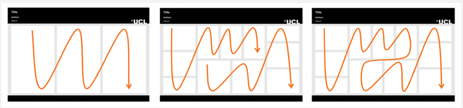
Consider reading flow:
Imagine you are reading your poster, or ask someone with fresh eyes to read it: does the natural order your audience reads your poster in match your expectation? From the UCL resource:
Text
- Bite-size pieces of information are easier to digest than large chunks!
- Use bigger text than you think you should!
- Consider organising the text of your poster into bullets,
- highlighting words that you want to jump off the page,
- and removing 90% of all jargon!
- For example, I know what the word zoonotic means in the context of malaria, but lots of people at a public health/applied maths/epidemiology conference may not! I’ll use “malaria that infects monkeys” instead! And, of course, a picture of the zoonotic malaria transmission cycle …
Pictures
There are lots of details that are important to a figure when we include it in a paper, that we should subtract when we use the same information in a slide deck or research poster. Supply the minimal detail to understand the idea/result that your figure is communicating. Make text big and concise and avoid technical language that we would need to read your paper to understand. Consider colourblind-friendly colour palettes (these resources might be helpful).
The University of Liverpool resource has a great example of how to format graphs for a poster:
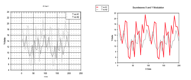
Another example - here’s a figure I put in this paper:

… and here’s what the same information looked like when I presented the project as a poster:
(This poster was for an online conference!)
Interactive elements
During a poster presentation, you only have a short window to catch the attention of your audience. You also have an advantage over giving an oral presentation: your audience can get right up close with your presentation! Interactive elements to a poster presentation can really increase audience engagement, and they don’t need to be direct or obvious. My favourite poster presentations have involved chalk annotations over a mathematical model diagram, a spring attached to a poster to explain the forces involved between cells in a mathematical model of wound-healing, and a jar of sand to start a discussion about the dynamics of a landslide. I presented a Shiny app as a poster with fishing wire to animate buttons and sliders!
Miscellaneous tips
-
Don’t forget to acknowledge co-authors/research groups/sponsors/grants involved in supporting your work (e.g., with a logo for a grant/sponsor)
-
Include a QR code to your website/linkedIn/preprint - if your audience has bookmarked you, they’re more likely to remember your research at a later date!
-
Once you have a draft, stand back! Imagine your draft at A0 size, across the other end of Radcliffe square - what things in your poster stand out from far away? Does it send a clear message when a reader can only see the title, pictures, and maybe some sub-headings?
Some examples
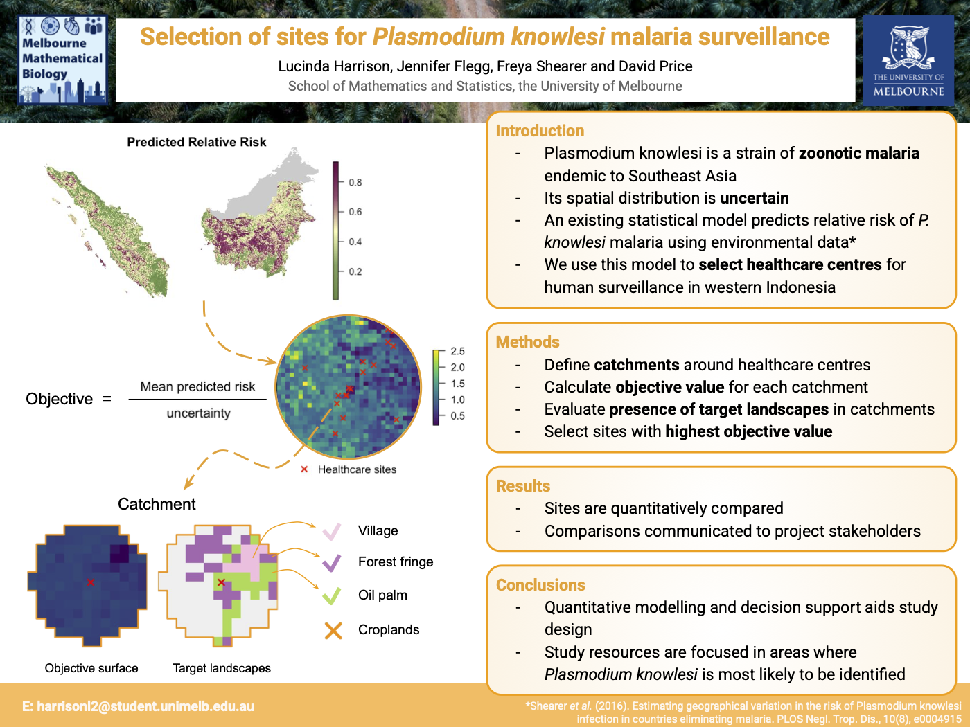
Now let’s have a look at some example posters from me + my friends :)
Let’s discuss:
- Who is the audience of each of these posters?
- What do we think the poster is about when we look at it from a distance?
- How much reading time do we need to get the gist of the poster?
- What do these posters do well?
- Where could these posters improve?
Aside: Better Poster
A different school of thought to the classic research poster is the better poster, which prioritises a single, headline result, and negative space for maximal impact. Love them or hate them, they do make us think a bit more critically about what we put on a poster!
Conclusion
Hopefully now you’re feeling confident and ready to whip up a great poster!
UniOxford has a print studio which I think is available to students and staff!
Download today’s workshop as a .pdf here